Chapters 1 and 2: Methods of Comparison
Chapter 3, 4 and 5: Here is a more streamlined version of Descriptive Statistics, Normal Distribution, Histograms.
Wondering what work is expected prior to drawing a histogram? Revisit this table made for Question 2 on HW 3.
Here is a copy of the class data on height (TR class).
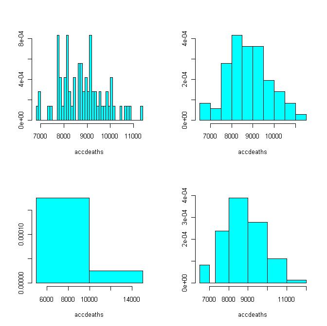
See histograms drawn for different partitions of the dataset accidental deaths.
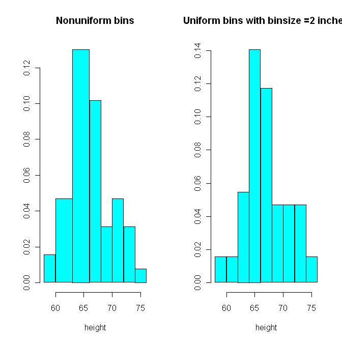
See histograms drawn for the height data for non-uniform bin sizes vs. uniform bin sizes.
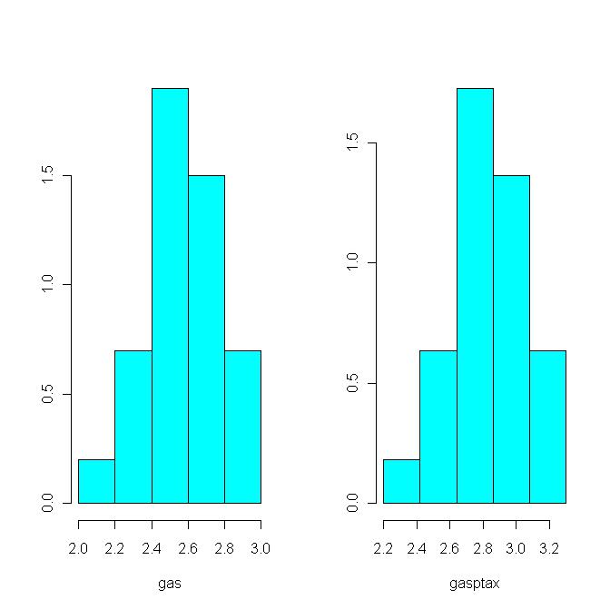
See histograms drawn before and after a 10% tax on gas (Motivated by Ch.4 Q.10). Note the tax increased both the average and the SD by 10%.
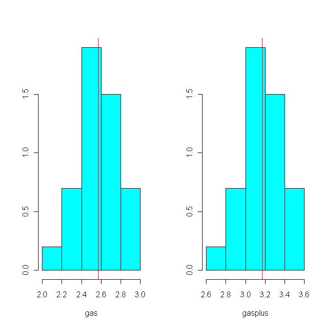
See histograms drawn before and after a $.60 flat fee on gas. Note the fee increases the average, but does not change the SD.
See Fig 3 on P.3 for an example of box-and-whisker plots: http://www.nature.com/nature/journal/v464/n7285/pdf/nature08821.pdf
Useful slides (read pages 34ff. this connects histograms to distribution curve): http://userpages.umbc.edu/~nmiller/POLI300/FREQUENCIES.ppt
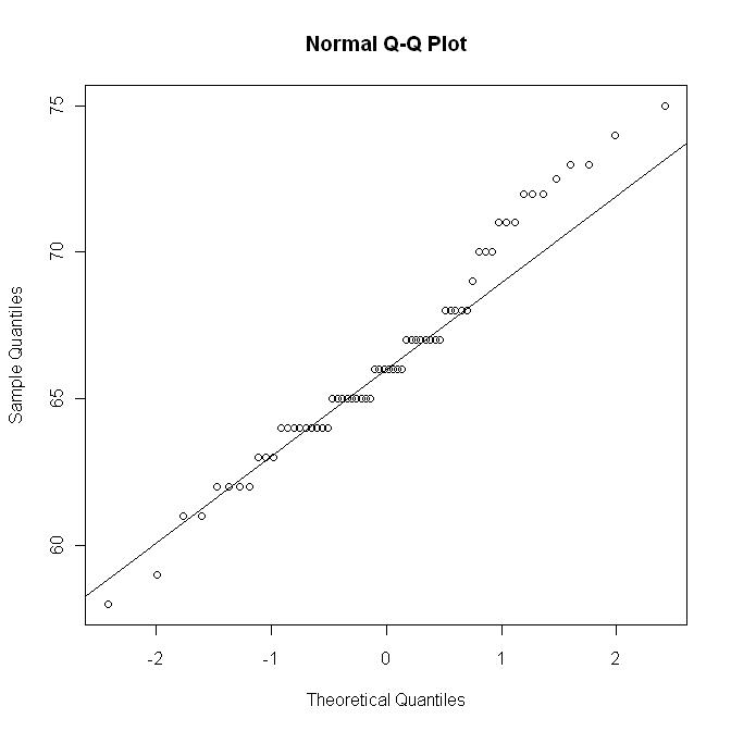
See a QQ-plot of the height data set. (Useful for visually checking normality, but will not be tested in this class.)
Here is a copy of the normal table from the workbook.
Chapter 8 and 9: Correlations between Data Sets
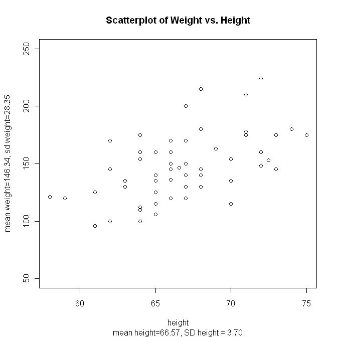
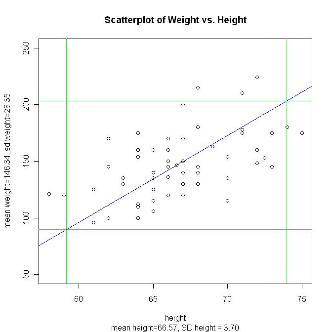
See the dataset hweight1.csv and the resulting scatter plot. See it with a 2-SD window and its SD line (SD line in blue). r = 0.54 (moderate correlation)
When data is given (as in this case), the correlation coefficient r can be calculated using formula in the Workbook
When data is not given, the correlation coefficient r can only be eyeballed (hence this estimation will not be on the exam). See Slide 23 of the above PowerPoint link.
Chapter 10 and 11: Regression line
Helpful Notes & lecture slides:(by Prof. McCarthy at Ohio University)
Chapter 13, 14 and 15: Probability
Alternate version of lecture notes on Chapters 13~14
Alternate version of lecture notes on Chapter 16, 17, 18
Chapter 16, 17 and 18: Expected Value and Central Limit Theorem (CLT)
Chapter 19, 20, 21 and 23: Sampling and Estimating Population Averages
Simulations:
(1) Suppose 10000 people each draws 100 tickets from the box. Here are the histograms (one overall and the other a zoomed-in snapshot) for the various % of 1’s found in the samples:
(2) Suppose 400 people each draws 100 tickets from the box. Here are the histograms (one overall and the other a zoomed-in snapshot) for the various % of 1’s found in the samples:
(3) Suppose 60 people each draws 100 tickets from the box. Here are the histograms (one overall and the other a zoomed-in snapshot) for the various % of 1’s found in the samples:
Chapter 26, 27, 28, 29: Hypothesis Testing